

Swiss-born Erik Nitsche was a pioneer in the design of books, annual reports, and other printed material that relied on meticulous attention to the details of page composition, the elegance of simple type presentation, and the juxtaposition of elements on a page. His hallmarks were impeccably clear design, brilliant colours, smart typography, and an adherence to particular geometric foundations.
Erik Nitsche left an unmistakable mark on the world of design in his approximately 60 year career. Leaving almost no field untouched, he worked as an art director, book designer, illustrator, typographer, graphic designer, photographer, advertiser, and packaging designer. His graphic design work included magazine covers, signage, film, exhibitions, posters and many other advertising mediums. Before emigrating to the United States in 1934 Nitsche studied at the Collège Classique in Switzerland and the Kunstgewerbeschule in Munich.His work has a distinctly modernist aesthetic and although he never had the opportunity to attend the Bauhaus Laszlo Moholy-Nagy has been quoted as saying, “Who is this guy that is doing the Bauhaus in New York?” He designed promotional and advertising campaigns for a host of different clients including department stores, feature films, record companies and the New York Transit Authority.
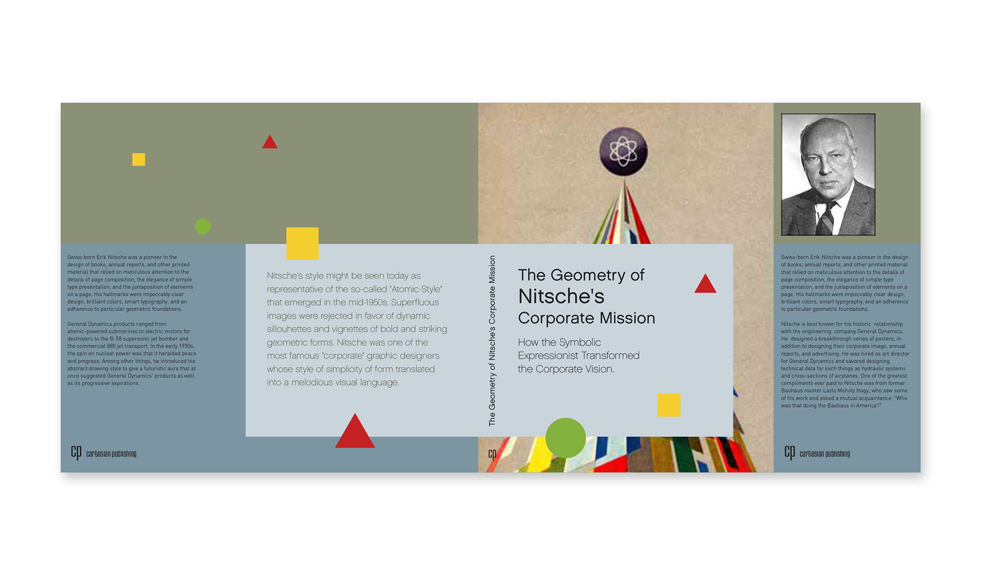
Nitsche is best known for his historic relationship with the engineering company General Dynamics, where he was hired as Art Director. He designed a breakthrough series of posters, in addition to designing their corporate image, annual reports, and advertising.
Nitsche greatly influenced the young generation of designers in America in the mid-20th century including the legendary designers Walter Bernard and Seymour Chwast.
Nitsche's style might be seen today as representative of the so-called "Atomic-Style" that emerged in the mid-1950s. Superfluous images were rejected in favor of dynamic silhouettes and vignettes of bold and striking geometric forms.